Grocery Store Layout Is Designed Against You — Here's the Map

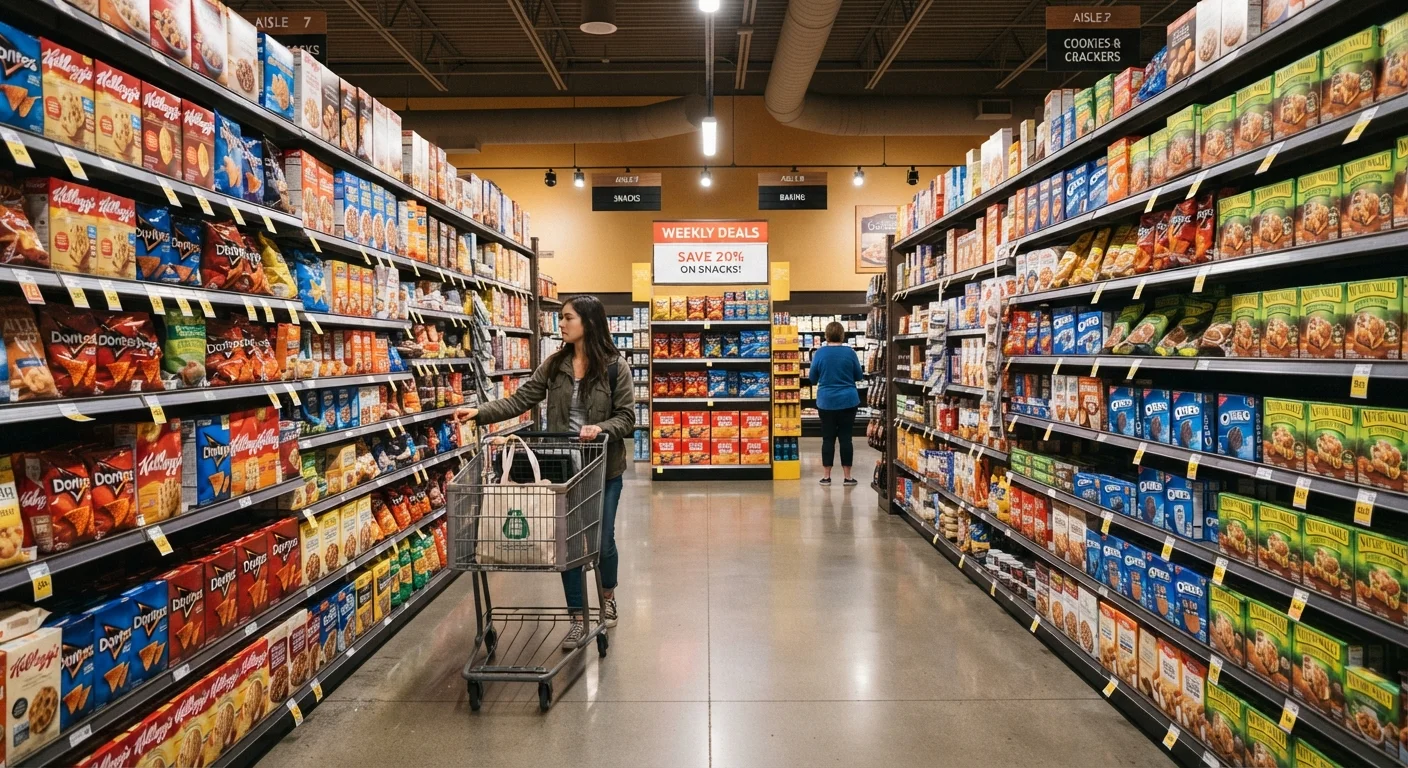
Photo: NemoFinds.com | Search, Explore, Read. editorial
Key Takeaways
- Staples like dairy, eggs, and bread are placed at the store's perimeter to pull you through the entire store.
- Eye-level shelves hold the highest-margin products; lower and upper shelves often hold better-value alternatives.
- End caps look like deals but frequently feature full-price or near-full-price items.
- Stores slow you down deliberately — wider aisles, music tempo, and sensory cues all affect how long you linger.
- Shopping with a list and a set path through the store is one of the most effective defenses against impulse spending.
The Perimeter Trap: Why You're Walking Laps
Walk into almost any full-service grocery store in the US and you'll notice the same pattern: produce greets you at the entrance, meat and seafood line the back wall, and dairy is tucked into the far corner. This isn't coincidence or convenience — it's a calculated floor plan designed to route you past as many products as possible before you reach the things you actually came for.
Fresh produce at the entrance serves a second purpose beyond routing: it creates a positive first impression. Bright colors and natural foods prime you psychologically to feel good about the shopping trip ahead, which research suggests makes you more receptive to other purchases. Meanwhile, the sensory pull of an in-store bakery near the entrance — warm smells, visible product — activates appetite cues early in your visit.
Understanding this loop helps you counter it. If your list is dairy-heavy, heading straight to the back of the store and working your way forward means you're navigating on your terms, not the store's. See our practical fixed-budget shopping habits for more on structuring a consistent grocery routine.
Eye Level, End Caps, and the Shelf Game
The middle two shelves in any grocery aisle are the most valuable real estate in the building. Manufacturers pay slotting fees — sometimes substantial ones — to place their products there. At eye level for adults, these positions catch attention without requiring any conscious effort from the shopper. The top and bottom shelves, by contrast, require extra effort to reach or crouch down for, and they often hold store-brand equivalents or larger value sizes worth your attention.
End caps — the displays anchoring each aisle — are equally strategic. They look promotional by design: bold signage, stacked product, and prominent placement all suggest a deal. But end cap placement is frequently purchased by brands, not awarded based on price. Always check the shelf tag for unit price and compare it to the same product a few steps down the aisle. You may find the "featured" item is priced identically or higher than its neighbors.
~70%
Grocery purchases that are unplanned
Industry research has long suggested the majority of grocery items purchased were not on the shopper's original list, reflecting the effectiveness of in-store placement and environmental cues.
15–20%
Premium paid for eye-level shelf space
Consumer goods manufacturers commonly pay slotting fees and co-op advertising dollars to secure prime shelf position, costs that are reflected in product pricing.
3–4x
More product exposure per shopper on a full perimeter loop
Routing staples to the back and far corners of a store meaningfully increases the number of category sections a shopper passes through on a typical trip.
Checkout lanes complete the picture. The narrow, slow-moving corridor is stocked with small, low-cost, high-impulse items — candy, magazines, single-serve beverages — specifically because you're standing still with time to look. These items carry some of the highest margins in the store relative to their size. This is also why many stores now offer "impulse-free" lanes, which represent a genuine option if you're managing a tight budget. For more on sorting shopping myths from reality, see shopping myths that keep people overpaying.
Sensory Tactics: Slowing You Down on Purpose
Beyond the physical layout, grocery stores deploy environmental cues that operate below conscious awareness. Music tempo is a well-documented lever: slower background music has been associated with slower shopper movement and higher average basket sizes in retail environment studies. Lighting is similarly strategic — warmer light in bakery and deli sections enhances the perceived freshness and appeal of food.
In-store sampling stations are another effective tool. Accepting a sample creates a mild psychological pull — a sense of obligation — that makes you slightly more likely to buy the product you just tasted. This is a real and studied effect in consumer psychology, not a retailer conspiracy theory. Being aware of it doesn't eliminate it, but it does let you pause and ask whether you actually want the item.
Shop With a List — And Stick to It
The solution isn't to shop with suspicion and stress — it's to reduce the number of unplanned decisions you make. A specific, section-organized list limits your exposure to these cues. So does setting a rough time limit for your trip. Pair this with a weekly grocery audit to catch gaps in your habits before they become patterns.
Navigating the Store on Your Own Terms
You can't rearrange the store, but you can control your own path through it. A few consistent habits reduce the impact of layout design significantly:
- Write your list by section, not by recipe, so you move through the store in one efficient pass rather than doubling back.
- Compare unit prices — the price-per-ounce or price-per-unit displayed on the shelf tag — rather than comparing package prices. Larger sizes aren't always cheaper per unit.
- Check the top and bottom shelves in any category where you buy frequently. Store brands and value options are disproportionately placed there.
- Pause before the checkout lane picks. Give yourself a deliberate moment to decide rather than dropping items in automatically.
If you've shifted some purchasing online, it's worth knowing when that channel works in your favor — and when it doesn't. Choosing between online and in-store depends heavily on the product category and what risks matter most to you.
Store layout is neither predatory nor accidental — it's a business optimized for its own interests, as most businesses are. The advantage goes to shoppers who understand the system and make deliberate choices within it.
Frequently Asked Questions
The content on this site is for informational purposes only and is not a substitute for professional advice. Always consult a qualified professional for guidance specific to your situation.