
Pattern Mixing: The Logic Behind Outfits That Shouldn't Work—But Do

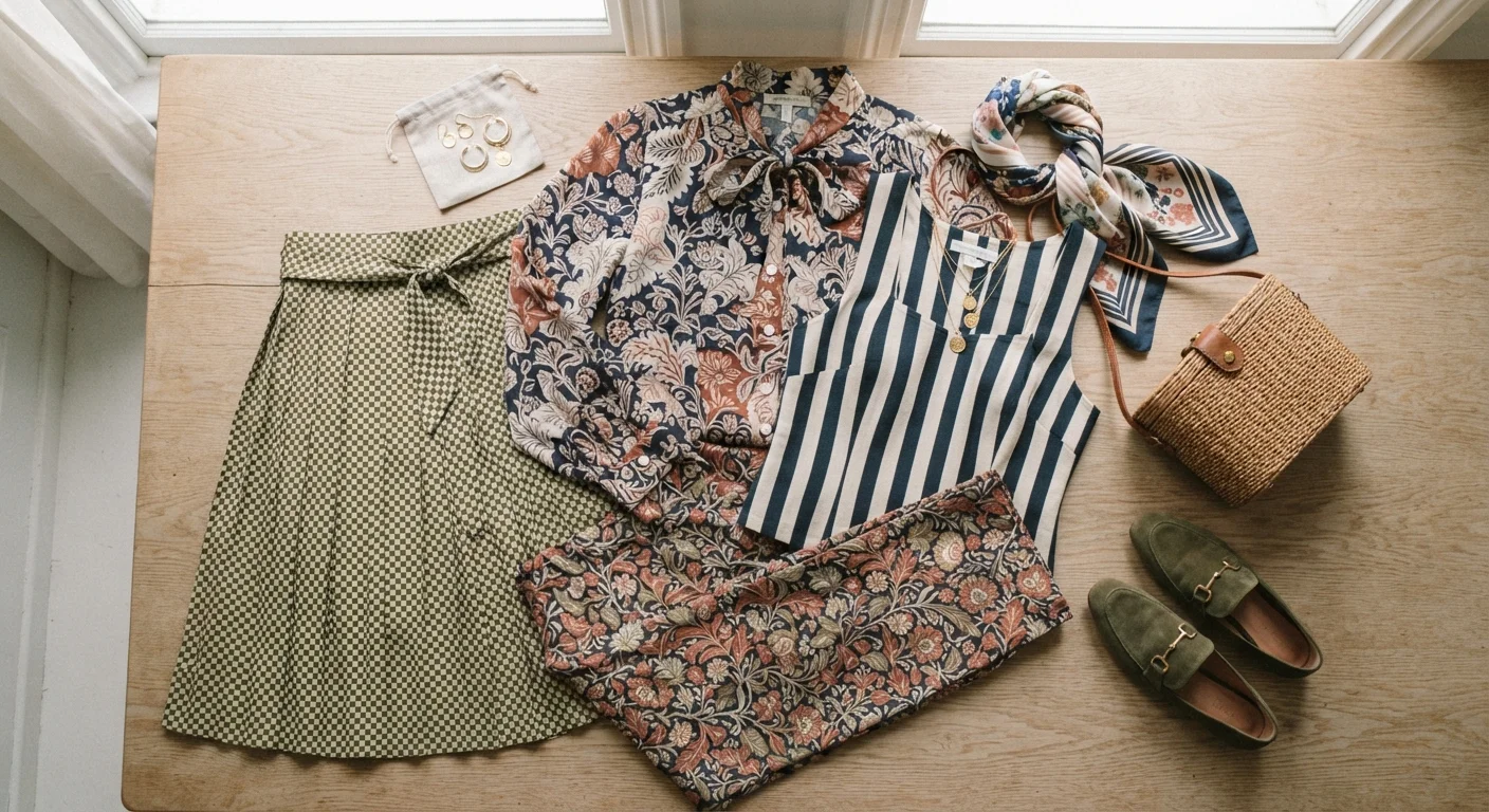
Photo: NemoFinds.com | Search, Explore, Read. editorial
Key Takeaways
- Vary pattern scale — pair a large print with a small one to avoid visual competition.
- Anchor mixed patterns with a shared color pulled across both pieces.
- Geometric and organic patterns (like stripes and florals) tend to complement each other naturally.
- Limit most outfits to two or three patterns to keep the look intentional, not chaotic.
- Neutrals and solid colors act as breathing room between busy prints.
Why Pattern Mixing Feels Scary (And Why It Doesn't Have to Be)
Most of us were told at some point that mixing prints is a fashion faux pas. Stripes with florals? Checks with abstract prints? Sounds like a recipe for a visual traffic jam. But that rule — like many style rules — is far more flexible than it sounds. See our breakdown of common style myths for more examples of rules worth questioning.
The truth is, the outfits that look effortlessly pulled together in editorials or on stylish people you admire often involve mixed patterns. The difference between a chaotic clash and a confident combination comes down to a handful of logical, learnable principles — scale, color, and pattern type. Once you understand these, your wardrobe opens up considerably.
What you will need
The Core Principles of Pattern Mixing
Before diving into the steps, it helps to understand the three pillars that determine whether a pattern combination succeeds.
Scale
Scale refers to the size of the pattern's repeat — how large or small the individual motif is. When two patterns are roughly the same size, they fight for visual dominance and the eye doesn't know where to rest. Pairing a large-scale print with a small-scale one gives each pattern a clear role: one reads as the focal point, the other as a supporting texture. Think a wide-stripe shirt with a tiny ditsy floral skirt, or a bold plaid coat over a fine-line pinstripe blouse.
For a deeper look at how size and proportion interact across an entire outfit, our guide on proportion and scale in outfit building is a great companion read.
Color
This is the most powerful unifying tool you have. When two different patterns share at least one color — even a shade, not an exact match — the eye reads them as intentionally connected rather than accidentally combined. A navy-and-white stripe and a floral that includes navy will look cohesive almost automatically. If you want to strengthen your overall color instincts, color coordination fundamentals lays out the core logic in plain terms.
Pattern Type
Geometric patterns (stripes, checks, grids, polka dots) and organic patterns (florals, paisleys, abstract brush marks) naturally contrast each other in structure, which actually makes them easier to combine than two geometric patterns competing for the same visual space. When in doubt, pair one structured pattern with one fluid one.
The Two-Pattern Rule Is a Starting Point, Not a Ceiling
How to Build a Pattern-Mixed Outfit Step by Step
Start with the dominant pattern
Choose the piece you want to build the outfit around — usually the one with the largest, boldest pattern. This becomes your anchor. Lay it flat or put it on, and note the specific colors within the print. You'll use these as your matching guide for everything else.
Choose a second pattern in a contrasting scale
Find a second patterned piece whose print is noticeably smaller or larger than the anchor. If your anchor is a chunky windowpane check, reach for something with a tight micro-print or thin stripe. The scale difference is what prevents the two from clashing — each occupies a different visual frequency.
Confirm a shared color between the two patterns
Hold the two pieces next to each other and look for at least one color they share — even if the shades are slightly different. A warm red in a floral and a brick-toned stripe count as a connection. This shared thread is what signals to the eye that the combination is deliberate.
Add a solid or neutral as a buffer if needed
If the two patterns feel like a lot together, introduce a solid-color piece — a belt, cardigan, trousers, or layer in one of the shared colors. This gives the eye a place to rest and lets each pattern breathe. It also makes it easier to adjust the visual balance without starting over.
Test the combination at a distance
Step back from the mirror — or take a photo — and view the outfit from about six feet away. At that distance, patterns start to read as texture and color rather than individual motifs. If the combination looks harmonious at a distance, it'll almost certainly work in real life. If one element still jumps forward aggressively, consider swapping it for a smaller-scale or lower-contrast version.
Once you've assembled your combination, take a quick full-length look in the mirror and squint slightly. If both patterns blur into texture rather than screaming for attention separately, you've likely found a balance that works. Remember that fit affects how patterns read on the body too — a well-fitted garment makes any print look more intentional.
Busyness Compounds Quickly
Pattern mixing works across virtually any wardrobe, whether you're building from a capsule collection of versatile, multi-context pieces or experimenting with pieces you already own. The investment is creative energy, not necessarily additional clothing.
The content on this site is for informational purposes only and is not a substitute for professional advice. Always consult a qualified professional for guidance specific to your situation.