
Color Coordination Without a Degree in Art

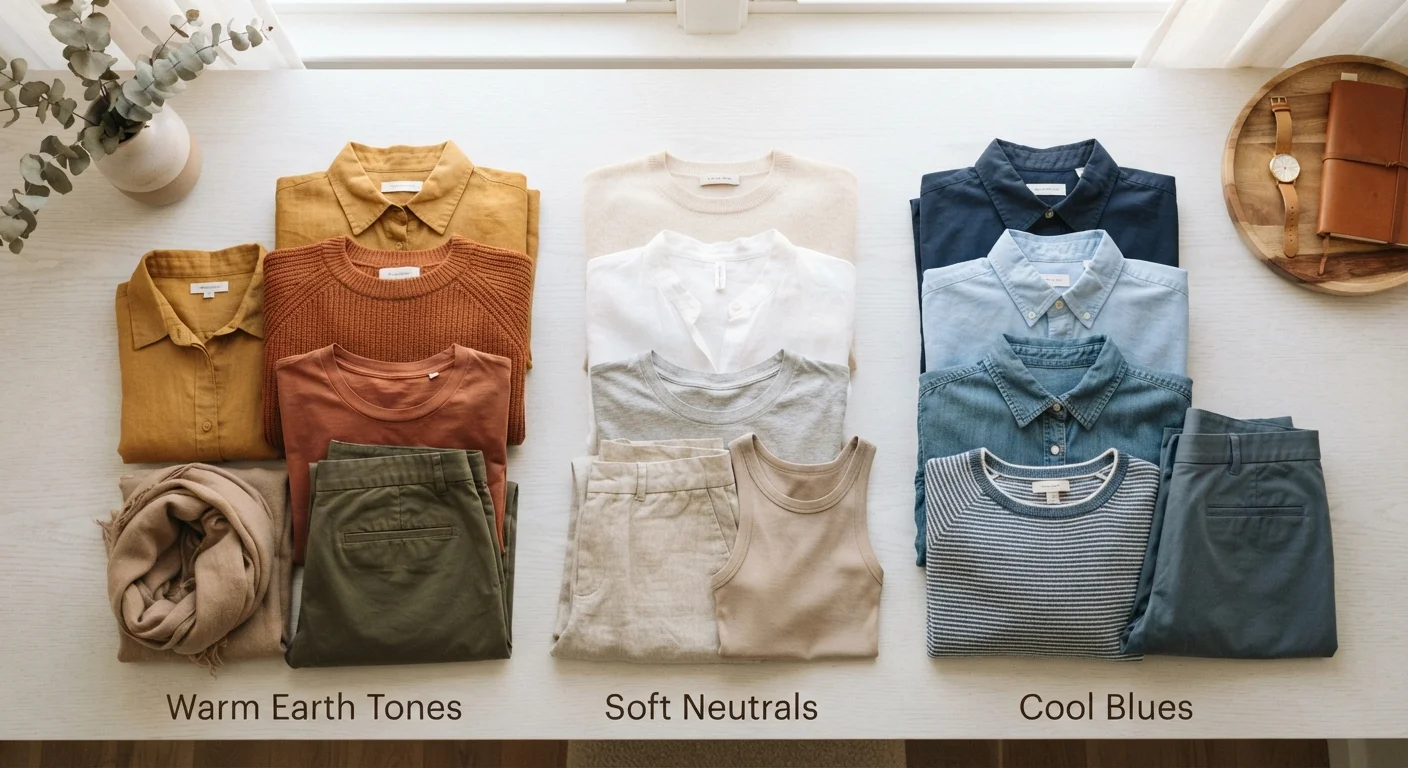
Photo: NemoFinds.com | Search, Explore, Read. editorial
Key Takeaways
- Complementary colors sit opposite each other on the color wheel and create bold, high-contrast outfits.
- Analogous colors sit next to each other and produce harmonious, low-effort combinations.
- Neutrals anchor any palette and make it easier to mix colorful pieces.
- Tonal dressing — wearing different shades of one color — is a reliable and elegant approach.
- Rules about which colors 'don't work' are mostly myths; contrast and proportion matter more.
- You don't need many colors to build a versatile wardrobe — depth within a palette goes further.
Why Color Coordination Feels Harder Than It Is
Most of us weren't taught color theory in any practical way. Fashion magazines show polished combinations without explaining why they work, and social media makes it look effortless — which can make the whole thing feel like a talent you either have or don't. You do have it. You just need a framework.
Color coordination isn't about matching perfectly or following rigid rules. It's about understanding a handful of simple relationships so you can make intentional choices rather than lucky guesses. Once those relationships click, getting dressed becomes a lot less stressful — and a lot more fun. For a broader look at foundational style thinking, see our guide to classic vs. timeless clothing.
Complementary colors
Colors that sit directly opposite each other on the color wheel. When paired together, they create strong visual contrast and energy.
Analogous colors
Colors that sit next to each other on the color wheel, like green, teal, and blue. They naturally harmonize and create calm, cohesive outfits.
Undertone
The subtle warm (yellow/red), cool (blue/pink), or neutral base beneath a color's surface. Matching undertones across an outfit helps everything feel cohesive.
Tonal dressing
An outfit made from different shades of the same color — for example, blush, dusty rose, and burgundy together. It's polished, low-risk, and always looks intentional.
Neutral
Colors like black, white, grey, navy, tan, and cream that pair easily with almost anything. They serve as anchors that let other colors breathe.
Accent color
A small amount of a contrasting or bold color used to add visual interest — typically in accessories or a single detail rather than a major garment.
The Color Wheel: Your Cheat Sheet
The color wheel organizes colors by their relationships to each other. You don't need to memorize it — you just need to know three pairing strategies:
- Complementary: Colors directly opposite each other (blue and orange, red and green, purple and yellow). These pairings are high-contrast and energetic. A burnt orange top with navy trousers is a classic complementary combo that feels bold but wearable.
- Analogous: Colors that sit next to each other (blue, blue-green, and teal). These feel calm and cohesive — great for an effortlessly put-together look without trying too hard.
- Triadic: Three colors equally spaced around the wheel (red, yellow, blue). More playful and complex — best approached with one dominant color and the others used as accents.
Warm colors (reds, oranges, yellows) and cool colors (blues, greens, purples) each carry a different energy. Mixing warm with cool can feel intentionally eclectic or accidentally discordant — keeping undertones consistent is one of the fastest ways to make combinations feel polished. This same principle comes into play when mixing patterns.
Neutrals: The Foundation of Any Wardrobe
Neutrals are the unsung heroes of color coordination. Black, white, grey, navy, camel, tan, and cream all work alongside almost every other color — making them indispensable anchors in any outfit.
Think of neutrals as a volume dial. A bright color paired with a neutral gets space to shine without overwhelming the eye. Two bright colors together demand more careful balancing.
Start with a Neutral Base
Tonal dressing — wearing varying shades of a single neutral — is one of the most elegant and low-effort approaches to color. A look built from ivory, sand, and warm brown reads as sophisticated and intentional with almost no risk of clashing. Our guide to versatile wardrobe pieces goes deeper on which neutrals earn their keep across different settings.
Building Outfits with Confidence
A practical starting point: the 60-30-10 principle. Use one color for roughly 60% of the outfit (usually a neutral base), a second for 30% (a secondary shade or soft color), and a third for 10% (an accent — think a scarf, shoe, or bag). This isn't a law, but it gives beginners a repeatable structure.
Another reliable method is to start with a multi-color item — a printed blouse, a plaid jacket, a patterned skirt — and pull individual colors from it to inform everything else you wear. The print has already done the color-matching work for you.
Proportion and scale also shape how color reads on the body. A large block of a bold color carries very differently than the same hue in a small accessory. Thinking about how much visual space each piece occupies helps you understand why some combinations land and others don't.
Lighting Changes How Color Reads
Common Color Myths — Busted
A few long-standing ideas about color are worth setting aside:
- "Navy and black don't work together."
- They do — especially when the tones are distinct enough. A midnight navy coat over a black outfit reads as deliberate, not accidental.
- "Certain colors only work for specific skin tones."
- This is largely a myth. Any color can work for any skin tone depending on the specific shade, undertone, and styling. Trust your own eye over outdated formulas.
- "You can't mix warm and cool colors."
- Mixing temperatures can feel intentional and interesting. The key is doing it with awareness rather than by default. For a deeper look at which style rules deserve to be questioned, see our breakdown of common style myths.
Color coordination is a skill that sharpens with practice. Start with one new pairing, see how it feels, and build from there. You don't need a degree — just a willingness to experiment.
Avoid Overloading on Trend Colors
Frequently Asked Questions
The content on this site is for informational purposes only and is not a substitute for professional advice. Always consult a qualified professional for guidance specific to your situation.